


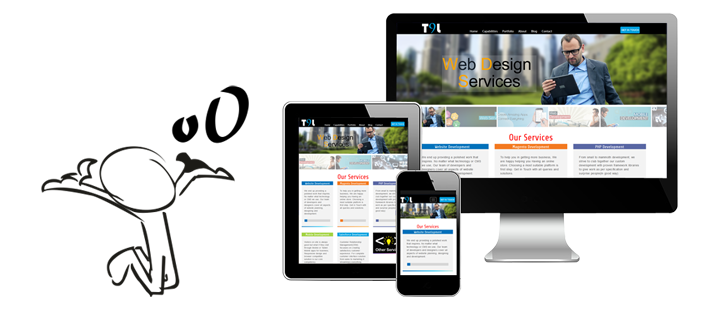
You Really Need A Responsive Website ?
What is a responsive website?
A responsive website has the capability to detect mobile viewing and resize itself to fit the device screen. Responsive websites are designed and developed to be flexible for different screen sizes such as Ipad, iPhone, Small Desktop, and Large Desktop. A responsive website’s ability to change sizes and information creates the optimal visitor experience from the same website on multiple platforms.
Not everyone should have a responsive website if:-
1) The layout of the website down to the last pixel is controlled by you,
2) A very visually intensive website is your requirement,
3) Your website contains a lot of animations,
4) Complex content and navigation on your website are your demand,
5) Your userbase is more Mature or traditional and
6) Mobile needs are specific
Who really needs to have a responsive website if:-
1) A clean and simple website is what you are looking for,
2) You don’t want complex content layout,
3) Your design and development decisions of website scales down to fit various smaller platforms and
4) Realize that your website will not be controlled down to the last pixel.
Sometimes we don’t even realize that website we are visiting is a responsive website or not as it looks similar to like any other website. To identify the responsive behavior of a site and to know if we are using a responsive website, then we need to change the size of your browser screen.


